Why Cover Letter Font Matters
In the competitive landscape of job applications, every detail counts. Your cover letter is your first opportunity to make a lasting impression on a potential employer. While the content is undoubtedly important, the font you choose plays a crucial role in how your letter is perceived. The right font can enhance readability, project professionalism, and subtly convey your attention to detail. Conversely, a poorly chosen font can distract the reader, make your letter appear unprofessional, and potentially lead to your application being overlooked. Therefore, understanding the significance of font choice is a critical step in crafting a compelling cover letter that grabs attention.
The Significance of Font Choice
Font choice is more than just an aesthetic preference it’s a strategic decision. The font you select communicates your personality, professionalism, and understanding of workplace norms. A clean, classic font suggests reliability and competence, whereas a trendy or overly stylized font might inadvertently signal a lack of seriousness or attention to detail. The font you choose must align with the industry you are applying to and also consider the specific company’s culture. Ultimately, the font serves as a silent ambassador, shaping the reader’s initial impression of your professionalism and the care you put into presenting yourself.
Impact of Font on Readability
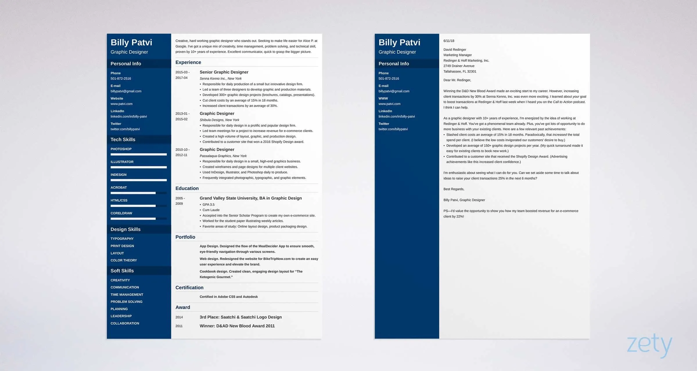
Readability is paramount in a cover letter. Recruiters and hiring managers often have to review numerous applications, and they appreciate a well-formatted document that is easy on the eyes. A font that is difficult to read, either due to its design or size, can quickly frustrate the reader, causing them to skim over your letter or, worse, discard it altogether. Consider factors such as the font’s x-height (the height of the lowercase ‘x’), the spacing between letters and words, and the overall clarity of its design. A font that is easily readable ensures that your message is effectively communicated without the reader having to strain or struggle.
Top 5 Cover Letter Fonts
Font 1 Arial
Arial is a widely-used sans-serif font known for its clean lines and excellent readability. It’s a safe and reliable choice that conveys a sense of clarity and professionalism. Due to its simplicity, Arial is easily readable at various sizes, making it a versatile option for cover letters. It’s a neutral font, meaning it doesn’t carry any strong personality traits, making it suitable for a wide range of industries and company cultures. Arial is a universally available font, ensuring that your cover letter will display correctly on any computer or device.
Advantages of Arial
- High readability at various sizes
- Clean and modern appearance
- Universally available
- Suitable for diverse industries
- Conveys professionalism without being overly formal
When to Use Arial
Arial is a solid choice for most cover letters, especially when you want a font that won’t distract from your content. It’s suitable for corporate environments, technology companies, and any industry where a clean and straightforward presentation is valued. It works very well for cover letters where the goal is to maintain a professional tone and ensure easy reading. Consider using Arial if you want to convey confidence and clarity in your application. A good font size to use with Arial is between 10 and 12 points, ensuring your content is easy to read without being too small or too large.
Font 2 Helvetica
Helvetica, another sans-serif font, is celebrated for its clear and balanced design. It’s a popular choice for its neutrality and versatility, offering a sleek and modern look. Helvetica is known for its legibility, making it an excellent choice for cover letters where clarity is essential. Its clean lines and unobtrusive design mean your message will be the focus, not the font itself. It’s a versatile font suitable for both print and digital formats.
Helvetica’s Attributes
- Exceptional readability
- Modern and clean aesthetic
- Versatile for various applications
- Widely available and supported
- Neutral, professional appearance
Appropriate Uses for Helvetica
Helvetica is an excellent choice for a wide range of industries. Because of its neutrality, it works well in the corporate world and creative fields. It is suitable for cover letters that require a contemporary, yet professional appearance. If you want to communicate confidence and attention to detail, Helvetica is a solid choice. Use a font size between 10 and 12 points for optimal readability and consistency with common document standards. Consider using Helvetica when you want to communicate your message without the font drawing too much attention to itself, making your cover letter look professional and polished.
Font 3 Times New Roman
Times New Roman is a classic serif font that is often associated with academia and traditional business. Its serifs (the small strokes at the end of letters) give it a more formal and traditional appearance. While it’s been a standard for decades, its use in cover letters has diminished as more modern fonts have gained popularity. Despite its familiarity, it’s still considered a safe choice, provided you use it judiciously.
Pros and Cons of Times New Roman
- Widely recognized and familiar
- Conveys a sense of formality
- Can appear dated in some contexts
- May not be as visually appealing as newer fonts
- Serifs can make it slightly less readable at smaller sizes
Situations Where Times New Roman is Acceptable
Times New Roman can still be appropriate for cover letters, especially if you are applying to a traditional or conservative industry, such as law, finance, or academia. However, it’s important to consider the specific company culture; a modern tech company may prefer a more contemporary font. Use Times New Roman with caution, and always ensure your cover letter stands out without appearing outdated. Aim for a font size of 12 points to ensure it remains legible.
Font 4 Calibri
Calibri is a sans-serif font that is the default in many modern word processing programs, such as Microsoft Word. It’s a clean and contemporary font, designed for optimal readability on screens. This makes it a solid choice for cover letters that may be viewed digitally, but it also works well in print. Calibri offers a modern, approachable look, making it suitable for various industries, but it’s important to ensure that its familiarity doesn’t make your cover letter blend in with the crowd.
Calibri’s Characteristics
- Clean and modern appearance
- Excellent readability on screen
- Widely available and supported
- Neutral and versatile
- Slightly more contemporary than Arial
Best Practices for Using Calibri
Calibri is a safe and effective choice for your cover letter if you want to project a modern and professional image. It is appropriate for a wide range of industries and is especially well-suited to cover letters that will be read on a screen. Its readability makes it a good option for companies that have moved to paperless hiring. However, consider whether it might seem too commonplace for your application. Ensure you use a font size of 11 or 12 points to maintain readability. This will ensure your cover letter looks clean, contemporary, and easy to read.
Font 5 Garamond
Garamond is a serif font known for its elegance and classic appeal. Its refined serifs and balanced design make it an excellent choice for cover letters that aim to project sophistication and attention to detail. Garamond is a slightly more unique option than other serif fonts, such as Times New Roman, making it an appealing choice for those who want to subtly stand out. Its timeless design ensures it will not look dated, making it a safe and stylish choice for many cover letter scenarios.
Garamond’s Distinctive Features

- Elegant and classic appearance
- Good readability
- Slightly more unique than other serif fonts
- Conveys sophistication and attention to detail
- Timeless design
Suitability of Garamond for Cover Letters
Garamond is an excellent font choice if you want to project a sophisticated image. It can be appropriate for applications in industries that appreciate a classic, refined style, such as design, marketing, or the arts. It is less common than other choices, so using Garamond can subtly set your cover letter apart. As with other fonts, ensure the font size is around 12 points to enhance readability. Consider using this font to add a touch of elegance to your application, showcasing your attention to detail and your ability to make informed design choices.
Tips for Choosing the Right Font
Choosing the right font is crucial, but several factors must be considered. The best font for your cover letter is one that enhances readability and projects a professional image that aligns with your industry and the company you are applying to. Remember that the goal is to create a positive first impression, so choosing a font that is both legible and appropriate is important. Experiment with different fonts to see how they look and feel. Here are some key tips to help you make the best choice for your application.
Consider the Tone of Your Letter
The tone of your cover letter should match the tone of the company. A more formal organization may appreciate a traditional serif font like Times New Roman or Garamond. On the other hand, a modern tech company or a creative agency may be more open to a clean sans-serif font such as Arial or Helvetica. Reflecting the culture of the company can improve your chances of getting a positive response. Before choosing a font, research the company’s brand identity to understand its style and values. Your font selection should work together with the tone of your writing.
Prioritize Readability
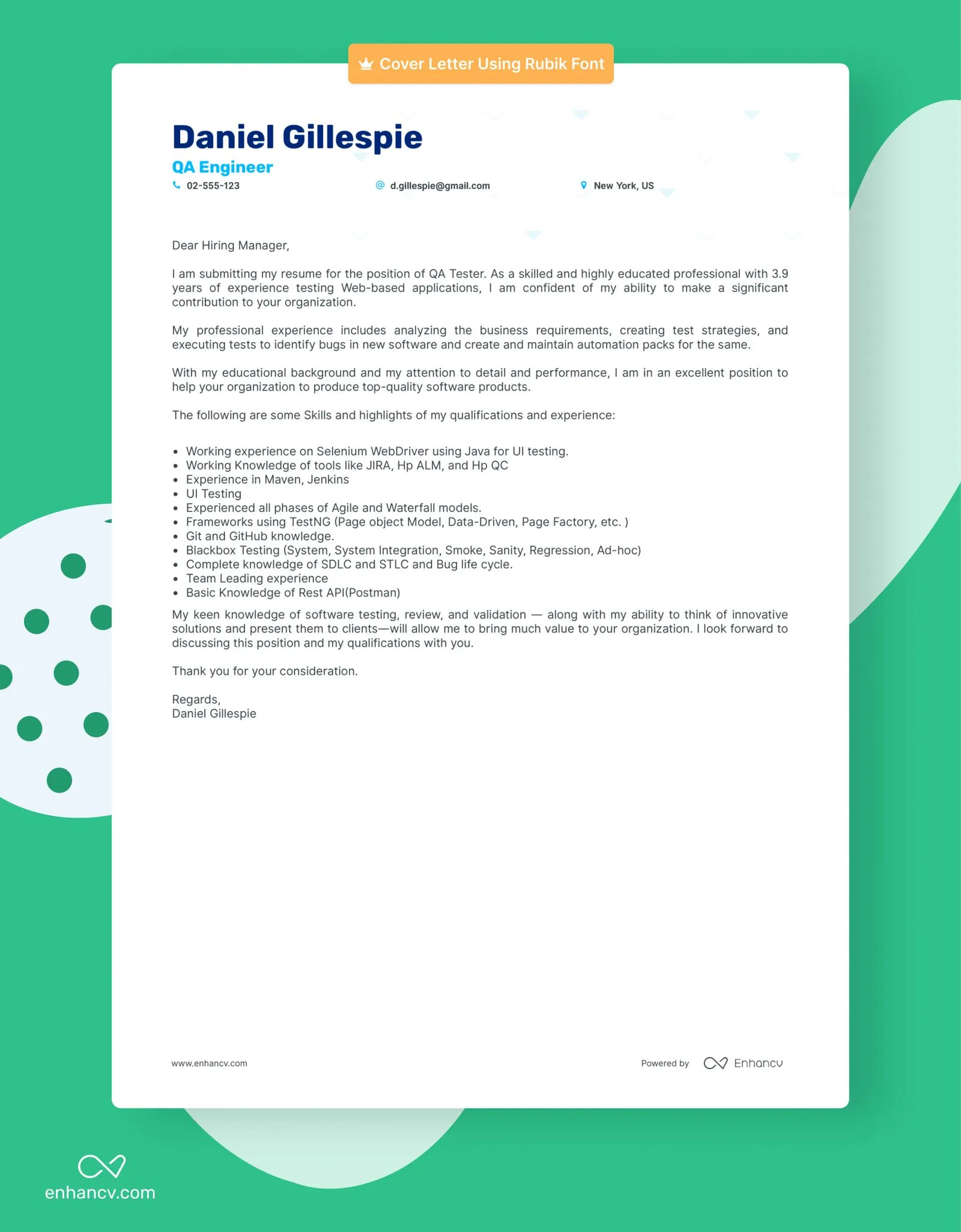
Readability should be a key priority when selecting a font. Your goal is to make it easy for the reader to absorb the content of your cover letter without straining their eyes. Choose fonts that are clear, easy to read, and do not have overly stylized letterforms. Avoid fonts that are too thin, condensed, or ornate, as they may be difficult to read, especially in smaller sizes. Ensure that there’s sufficient spacing between letters and words. Test your chosen font at different sizes to determine its readability on both screens and in print. A well-chosen, legible font will help your cover letter be more effective and will show your attention to detail.
Maintain Consistency
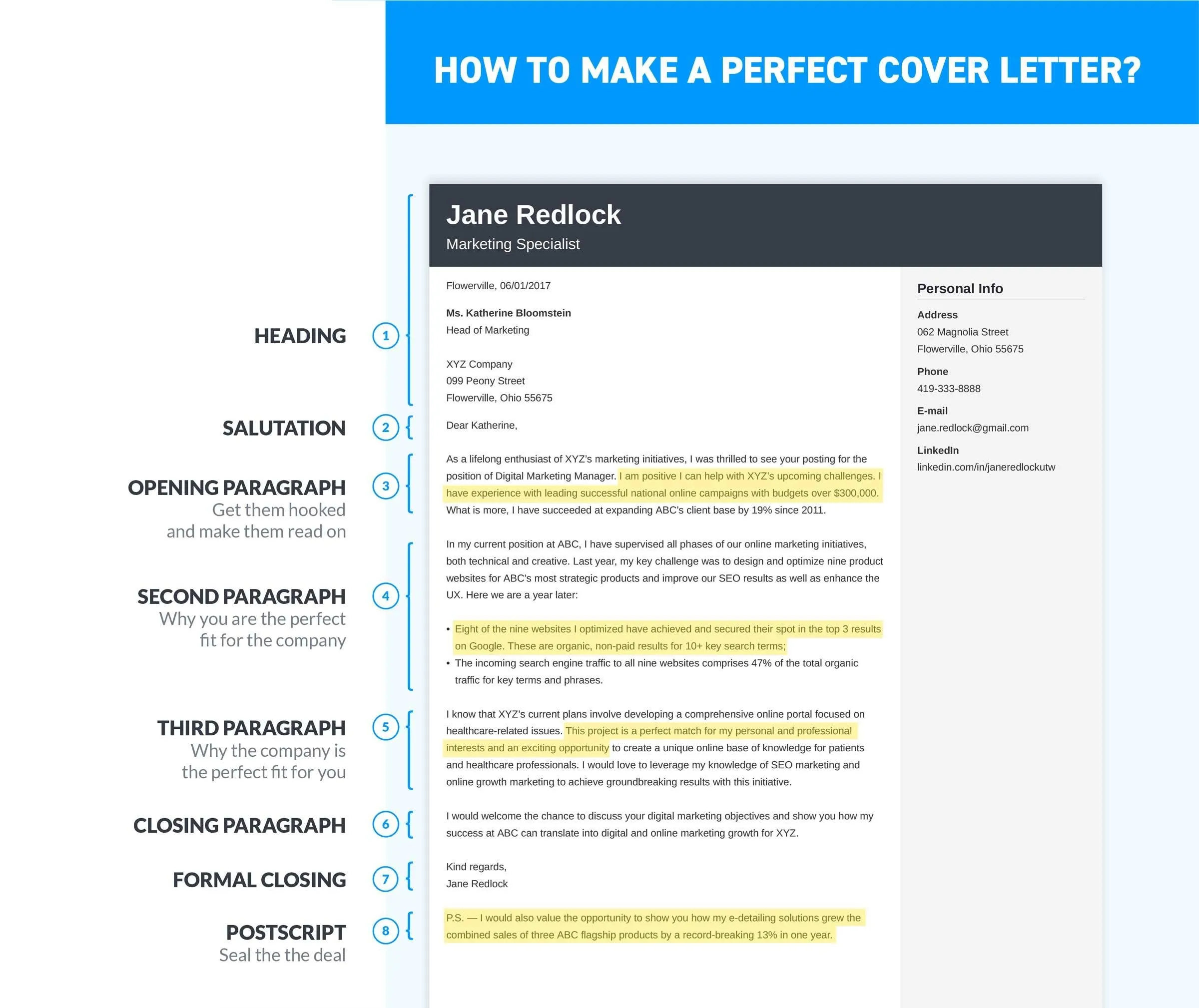
Consistency is critical when it comes to your cover letter. Once you have chosen a font, stick with it throughout the document. Avoid mixing different fonts, as this can make your cover letter appear unprofessional and disorganized. Maintain the same font for your headings, body text, and any other elements in your cover letter. Be consistent in font size and style throughout the document for a polished and professional look. If you are attaching a resume, ensure that you use the same font in both documents to maintain a cohesive brand.
Avoiding Common Font Mistakes
Even small errors in font selection can negatively impact the impact of your cover letter. While the details may seem minor, they can cumulatively affect the overall impression of your application. Avoid these common font mistakes to enhance your chances of success. Take the time to review your choices and make sure that you’re projecting the best image possible. By avoiding these errors, you will ensure that your cover letter is easy to read and projects an image of professionalism.
Font Size Errors
Using the wrong font size is a frequently made error. If the font is too small, it can be difficult to read, which can frustrate the reader. If the font is too large, it can make your letter seem unprofessional. The appropriate font size for most cover letters is between 10 and 12 points. In general, 11 or 12 points are considered standard. Always make sure that the text is clear and easy to read without straining your eyes. Review the cover letter in both print and digital formats to see whether the size is suitable.
Inappropriate Font Choices
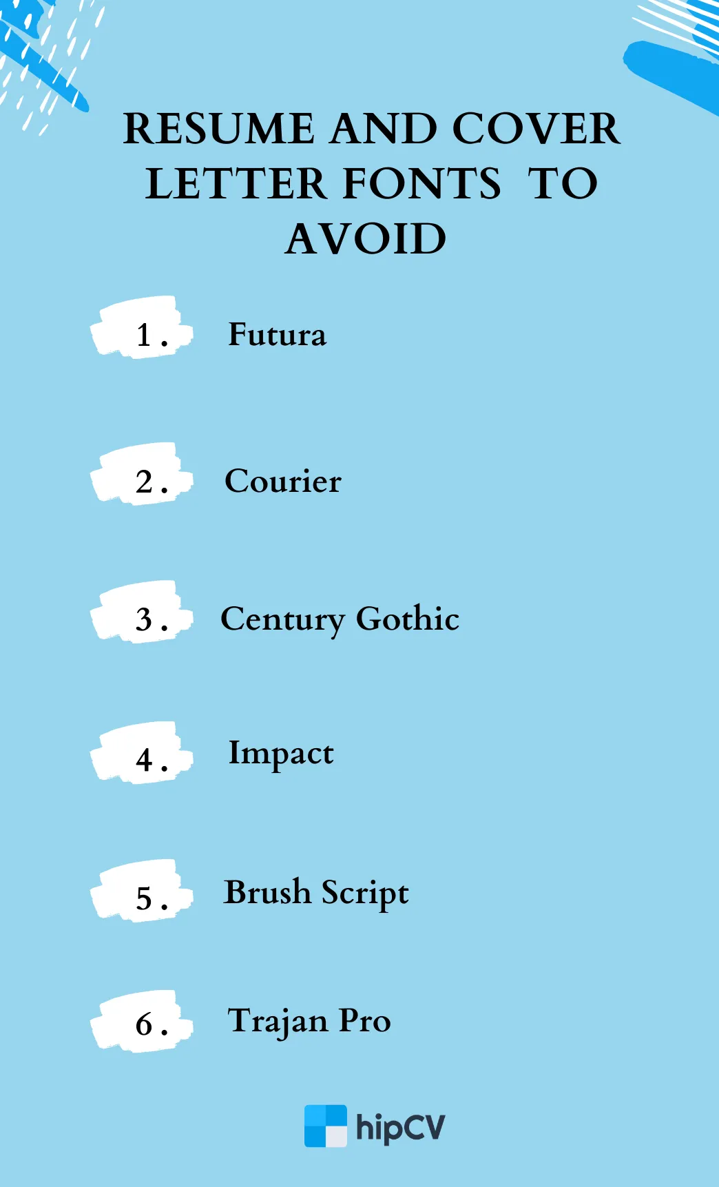
Avoid selecting fonts that are too stylized, novelty, or difficult to read. These fonts can distract the reader and detract from the message you are trying to convey. Comic Sans, for instance, is widely seen as unprofessional and is best avoided. Additionally, stay away from fonts that have a dated appearance or that clash with the overall tone of your cover letter. When in doubt, stick with classic and well-established fonts that project a sense of professionalism.
Overuse of Bold or Italics
While bolding and italics can be helpful for emphasis, overuse can make your cover letter appear cluttered and unprofessional. Use these styles sparingly and strategically, only to highlight key phrases or important information. Excessive use of bolding and italics can distract the reader and make the document less readable. Avoid using bolding and italics on long paragraphs or entire sections. Using these formatting options sparingly will help your cover letter look clean and focused.
