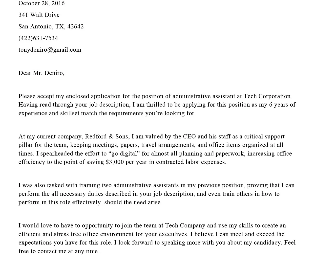
Understanding Cover Letter Typography
Your cover letter is more than just a document; it’s a visual representation of your professionalism and attention to detail. The choice of font and size plays a crucial role in how your cover letter is perceived by potential employers. It’s about more than just aesthetics; it’s about communicating effectively and ensuring your message is easily understood. Typography, the art of arranging type, significantly influences readability and the overall impression your application makes. A well-chosen font and size can immediately signal that you care about presentation, while a poorly chosen one can create a negative impression, potentially leading to your application being overlooked. Understanding the nuances of typography in the context of a cover letter is a critical step in crafting a successful application.
Why Font Choice Matters
The font you select for your cover letter communicates volumes before the hiring manager even reads a word. It sets the tone, reflects your personality, and impacts the readability of your letter. A professional and easily readable font implies attention to detail and respect for the reader’s time. Conversely, a font that’s too elaborate, difficult to read, or unconventional can distract from your qualifications and skills. Different fonts evoke different feelings; for example, a serif font like Times New Roman can convey a sense of tradition and reliability, while a sans-serif font like Arial or Helvetica can project a modern and straightforward image. Your font choice should align with the industry you’re applying to and the overall impression you wish to make. Think of it as part of your personal brand – it should be consistent with the image you’re trying to project as a capable and thoughtful candidate.
When choosing a font, consider the potential employer’s perspective. Many hiring managers quickly scan through dozens, or even hundreds, of cover letters and resumes. Therefore, you want to make it as easy as possible for them to find the key information and to appreciate the overall message you are sending. Readability is paramount. A font that is difficult to read, even if it looks stylish, will work against you. It’s vital to strike a balance between aesthetic appeal and practical functionality. Remember, your goal is to showcase your qualifications, experience, and personality in the most effective way. The right font choice will help you achieve this goal.
The Importance of Readability
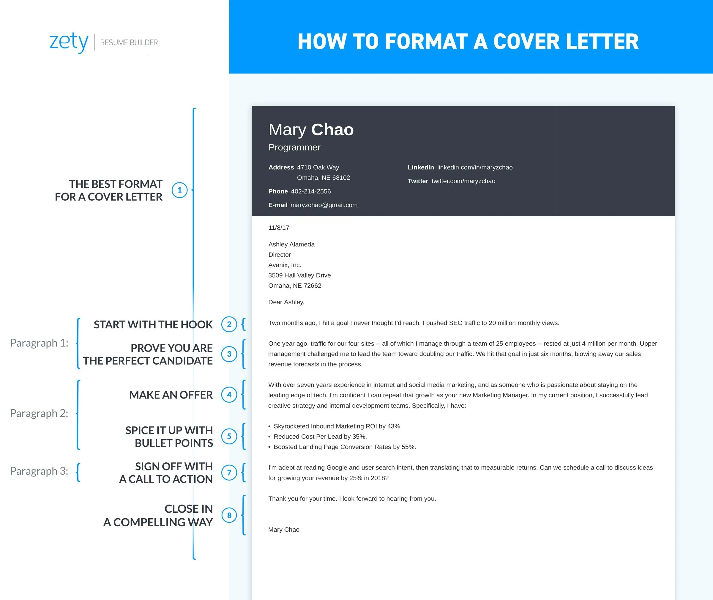
Readability is the cornerstone of an effective cover letter. If your cover letter is difficult to read, the hiring manager is less likely to invest the time needed to understand your qualifications. This is not simply about choosing a font that looks nice; it is about ensuring that your message is clear, concise, and easy to digest. The best fonts are those that provide a balance between style and practicality. They must be legible at various sizes and on different devices, from printed copies to digital screens. Avoid fonts that are overly ornate, condensed, or handwritten-style. While these fonts might seem creative, they often sacrifice readability, especially when printed or viewed at a small size.
Beyond the font itself, other factors influence readability. These include the font size, line spacing, and the overall layout of your cover letter. Ensure you have sufficient spacing between lines, paragraphs, and sections to create visual breathing room. This helps prevent the document from appearing cluttered or overwhelming. Use a consistent font size throughout, typically between 10 and 12 points, and ensure the text is dark enough to be easily read. Proofread your letter carefully to eliminate any typos or grammatical errors, as these can also detract from readability. The ultimate goal is to provide a seamless reading experience that highlights your strengths and keeps the hiring manager engaged.
Top 5 Fonts for Your Cover Letter
Selecting the right font for your cover letter is crucial. While personal preference plays a role, certain fonts are widely accepted as professional and readable. Here are five top-tier font choices that will help you create a strong first impression:
Arial for Professionalism
Arial is a sans-serif font known for its clean lines and straightforward appearance. Its simplicity makes it an excellent choice for cover letters, as it conveys a sense of professionalism and modernity without being overly stylized. Arial is highly legible, even at smaller sizes, making it suitable for both print and digital applications. Its widespread availability ensures that your cover letter will look the same regardless of the reader’s operating system or software. This font is a safe and reliable option if you want a font that does not distract from the content itself, letting your skills and experience shine.
Choosing Arial Font Size
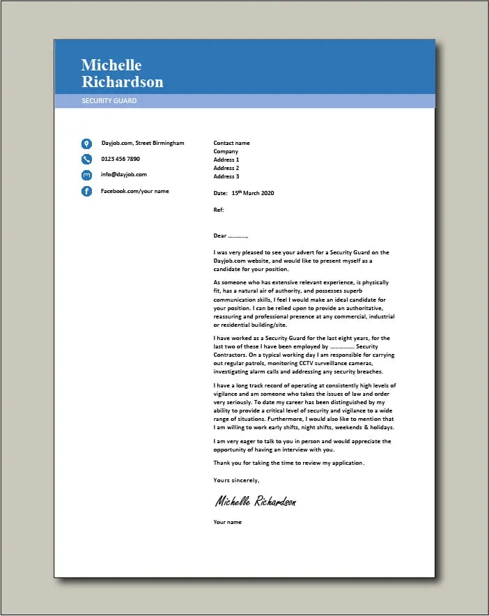
For Arial, a font size of 11 or 12 points is generally recommended. This size range offers optimal readability without taking up too much space on the page. Ensure that the font size is consistent throughout the document. This enhances readability and avoids any visual inconsistencies that can be distracting. Maintain a uniform appearance across headings, body text, and any other elements in your cover letter.
Times New Roman for Classic Appeal
Times New Roman is a serif font that exudes a sense of tradition, reliability, and formality. Widely used in academic and professional settings, it offers a classic look that can be particularly suitable for more conservative industries or roles. The serifs, small strokes at the end of each letter, help guide the eye, contributing to excellent readability. If you’re targeting roles in law, finance, or government, Times New Roman can be a safe and effective choice, projecting an image of stability and trustworthiness.
Optimal Size for Times New Roman
For Times New Roman, a font size of 12 points is often preferred. This size ensures optimal legibility and maintains the font’s classic appearance. It’s important to maintain consistency, and also to ensure it’s in sync with the font choice. Avoid any variations in font size within the main body of your text, as this can disrupt the flow and impact readability. Headings can be slightly larger, usually 14 or 16 points, to create a clear hierarchy of information.
Calibri’s Modern Look
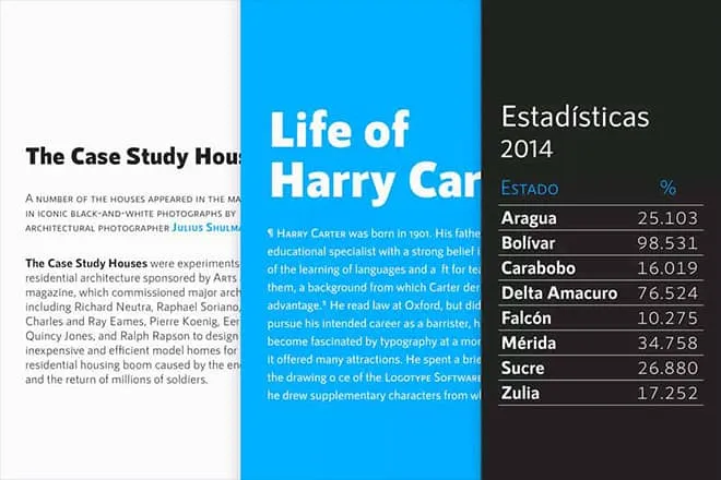
Calibri, a sans-serif font, offers a modern and friendly aesthetic. It’s a highly versatile font, suitable for various industries and applications. Its clear and rounded letterforms make it easy to read on both screen and paper, making it a popular choice for cover letters. Calibri avoids the starkness of some other sans-serif fonts, lending a more approachable feel. The font’s clean lines and contemporary feel can be particularly suitable if you are applying for creative roles, but it is professional enough for a wide range of applications.
Calibri Font Size Recommendations
For Calibri, using a font size of 11 or 12 points works very well. These sizes allow for easy reading without overwhelming the page. This font’s design, combined with the recommended sizes, ensures that the document presents a clean and well-organized look, which is essential for conveying professionalism. Make sure to apply the same font size throughout the document to maintain visual consistency.
Roboto’s Contemporary Style
Roboto is a sans-serif font that strikes a balance between a modern and approachable feel. Its clean lines and open letterforms provide excellent readability. Roboto is versatile and works well in various contexts, making it a reliable choice for your cover letter. The font’s design is slightly geometric, giving it a contemporary appearance without sacrificing readability. This makes Roboto a good option for tech companies or any role that values a modern aesthetic.
Roboto Font Size Guidelines
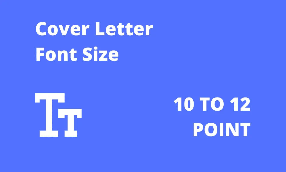
For Roboto, a font size of 11 or 12 points is ideal. This range ensures that the text is easy to read while maintaining a professional appearance. The font size recommendations can be adapted slightly based on personal preference. The key is ensuring that the text is not too large or too small and that the overall presentation is balanced and professional. Consistency in font size across the document is key to a polished look.
Helvetica’s Clean Aesthetics
Helvetica, a timeless sans-serif font, is known for its clean, neutral appearance. Its simplicity and clarity make it a safe and professional choice for cover letters. Helvetica is highly legible and works well in various settings, conveying a sense of reliability and sophistication. While it lacks the distinctive personality of some other fonts, its straightforward style ensures that the focus remains on your content. Helvetica’s versatility makes it suitable for a broad range of industries and roles, and its clean aesthetic appeals to a wide audience.
Helvetica Font Size Suggestions
For Helvetica, a font size of 11 or 12 points is recommended. These font sizes offer optimal readability while ensuring a professional look. The recommended font sizes work well with the font’s clean design, ensuring that the cover letter text is readable and professional. Stick to the recommended size to ensure your cover letter is easy to read and visually appealing.
Formatting Your Cover Letter
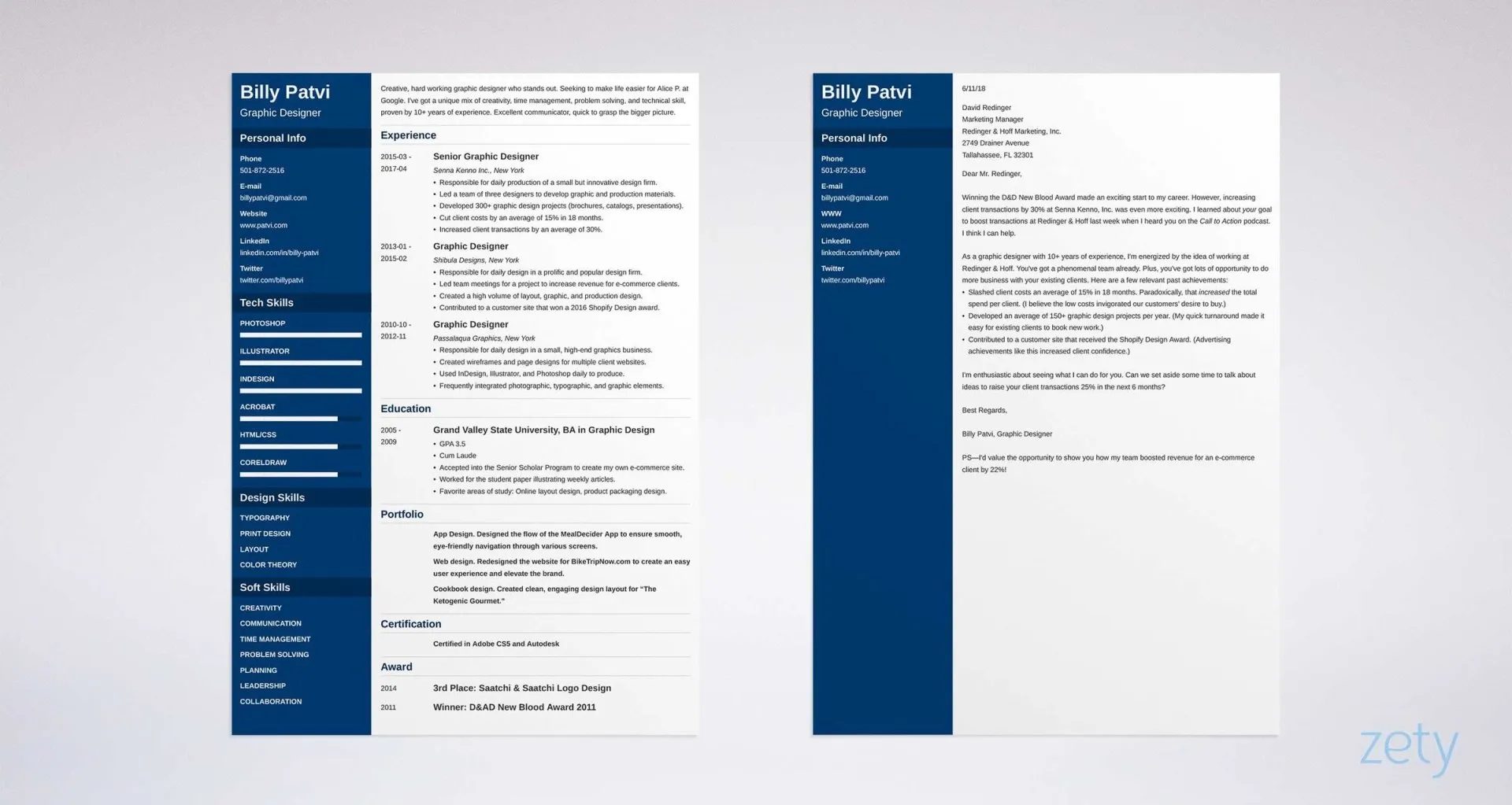
Proper formatting is crucial for a professional cover letter. Beyond choosing the right font and size, consider elements like line spacing, margins, and alignment. These details collectively contribute to the overall readability and visual appeal of your document. Consistent formatting demonstrates that you are detail-oriented and considerate of the reader’s experience.
Font Size Best Practices
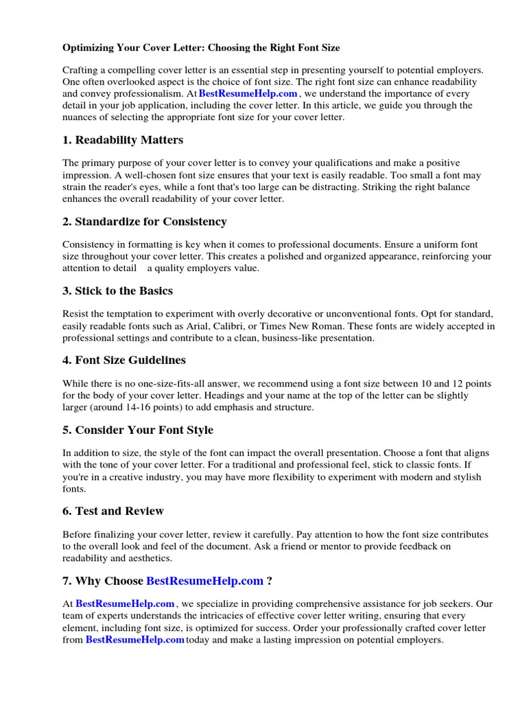
Stick to a font size between 10 and 12 points for the body text. This size range is generally considered optimal for readability. Headings can be slightly larger, typically 14 to 16 points, to provide visual hierarchy. Be consistent with the size throughout the document, avoid drastic changes that can distract the reader. Using a consistent font size enhances the professional look and ensures that your message is clear and easy to understand.
Line Spacing Considerations
Adjust line spacing to provide enough visual separation between lines of text. A line spacing of 1.15 to 1.5 is generally recommended. This helps prevent the text from appearing cramped and makes it easier for the reader to follow the flow of your writing. Adequate line spacing improves readability and enhances the overall appearance of your cover letter, making it more inviting to read.
Proofreading and Editing
Before you send your cover letter, proofread it carefully to eliminate errors. Review it for typos, grammatical errors, and inconsistencies in formatting. A well-proofread cover letter shows that you are detail-oriented and take your applications seriously. Ask a friend or family member to review it as well, as a fresh set of eyes can often catch errors that you may have missed.
Ensuring Readability
Readability is about making your cover letter easy to read. A clean layout, appropriate font size, and sufficient line spacing all contribute. Aim for a layout that is not crowded or overwhelming. Use white space effectively to separate different sections and elements. Make sure the text is easily scannable, so that the hiring manager can quickly grasp the essential information. The more readable your cover letter is, the more likely it is that your message will be understood and appreciated.
Common Cover Letter Font Mistakes
There are common font-related mistakes that can undermine your cover letter’s effectiveness. Avoiding these mistakes will help you create a polished and professional application.
Avoiding Poor Font Choices
Avoid fonts that are too decorative, such as script or display fonts. These fonts can be challenging to read and may not convey a professional impression. Stay away from fonts that are overly stylized or unconventional, unless they align with the specific job or industry requirements. Remember, the goal is to ensure that your qualifications and experience stand out, not the font itself.
Font Size Errors to Dodge
Steer clear of font sizes that are too small or too large. Small font sizes can strain the reader’s eyes, while excessively large fonts can make your document appear unprofessional. Maintain a consistent font size across all sections of your cover letter. Inconsistencies in font size can be distracting and detract from the professional look. Stick to the recommended sizes to optimize readability and maintain a clean, professional appearance.
